Üretiminize Akıllı Dokunuş
Mevcut makineleriniz için birebir uyumlu, dayanıklı ve uzun ömürlü yedek parçalar üretiyoruz
1

Mevcut makineleriniz için birebir uyumlu, dayanıklı ve uzun ömürlü yedek parçalar üretiyoruz
Ölçü, malzeme ve kullanım şartlarına uygun özel yedek parça imalatı yapılmaktadır.
İhtiyacınızı dinler, sürecinizi analiz eder ve en uygun makine çözümünü geliştiririz.
Verimli, güvenilir ve yüksek performanslı özel makineler,..
Verimli, güvenilir ve yüksek performanslı özel makineler..
Verimli, güvenilir ve yüksek performanslı özel makineler,.
Verimli, güvenilir ve yüksek performanslı özel makineler,..
İhtiyacınızı analiz eder, sürecinize en uygun makineyi birlikte tasarlarız.
Özel makina imalatı; üretiminize özel tasarlanmış, verimliliği artıran ve süreçlerinizi optimize eden mühendislik çözümleridir
Satış sonrası destek, bakım ve revizyon hizmetlerimizle uzun vadeli çözüm ortağınız oluruz. .

İlk seferde ve her seferde doğru ürün sunarak; aranan ve tercih edilen bir firma olmak.


Sektöründe müşterilerimize en doğru ve en iyi hizmeti dinamik bir şekilde sağlayabilmek..
Müşterilerimizin sektördeki tüm ihtiyaçlarına yönelik özel çözümler geliştiriyor, projelerimize verimlilik, dayanıklılık ve yüksek performans odaklı yaklaşıyoruz
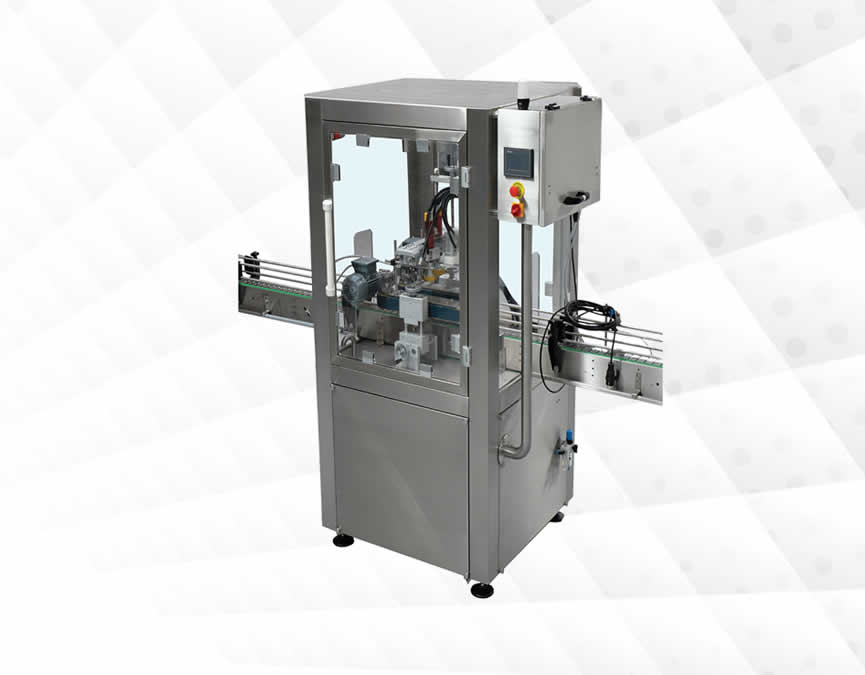
Özel Makina İmalatı, standart makinelerin yetersiz kaldığı veya spesifik üretim ihtiyaçlarının.
Devamı ...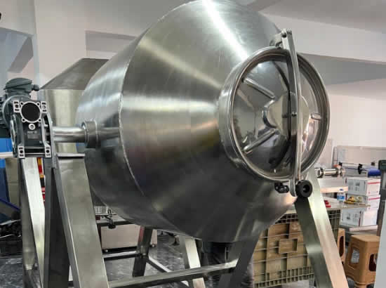
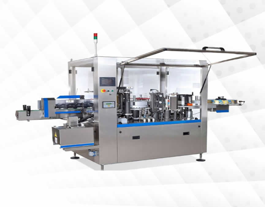
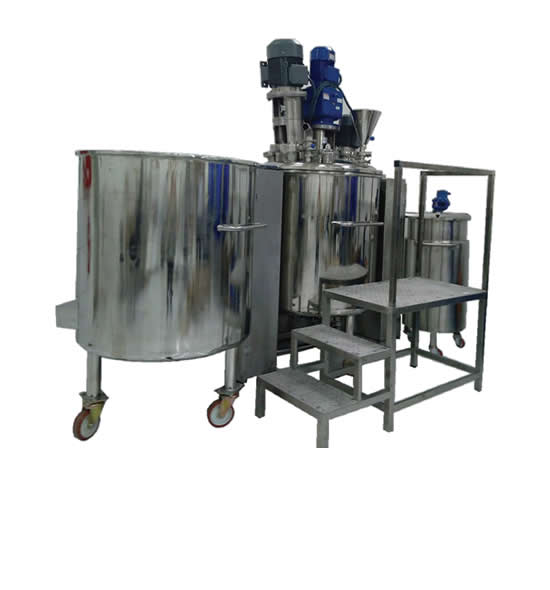
Toz Karıştırıcı Mikserler, üretim süreçlerinde ürün kalitesini artırırken verimliliği ...
Devamı ...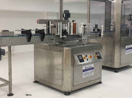
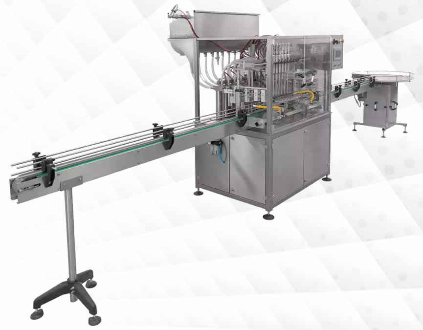
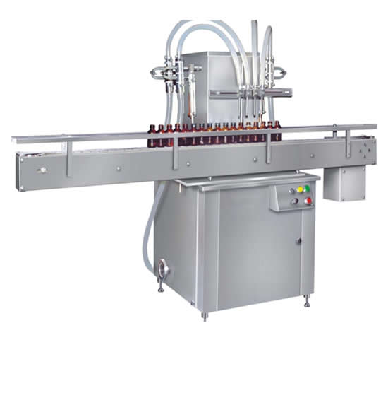
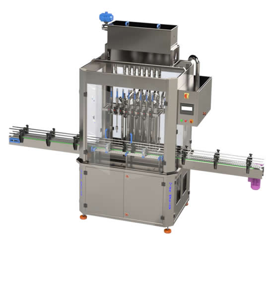
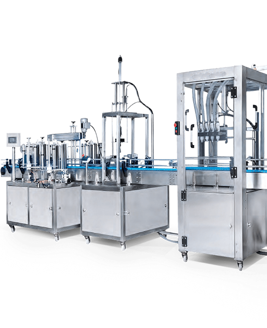
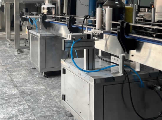
Ürün yapısı, dolum hassasiyeti, ambalaj tipi ve üretim kapasitesi dikkate alınarak
Devamı ...